Videoland
Revitalizing the top Dutch streaming service
EXPERTISE
Visual Identity
Motion Branding
CLIENT
RTL
YEAR
2021
project info
The aim
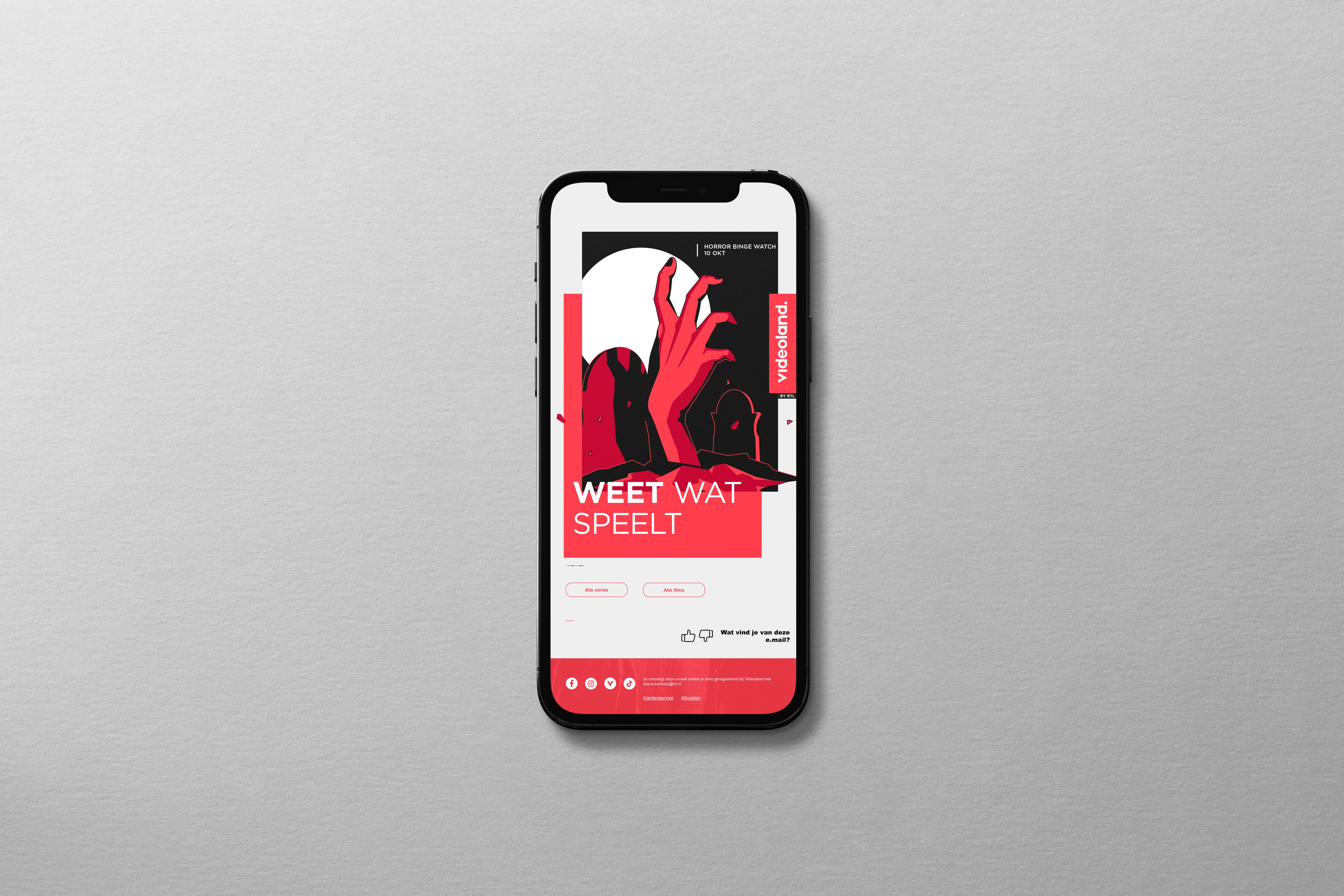
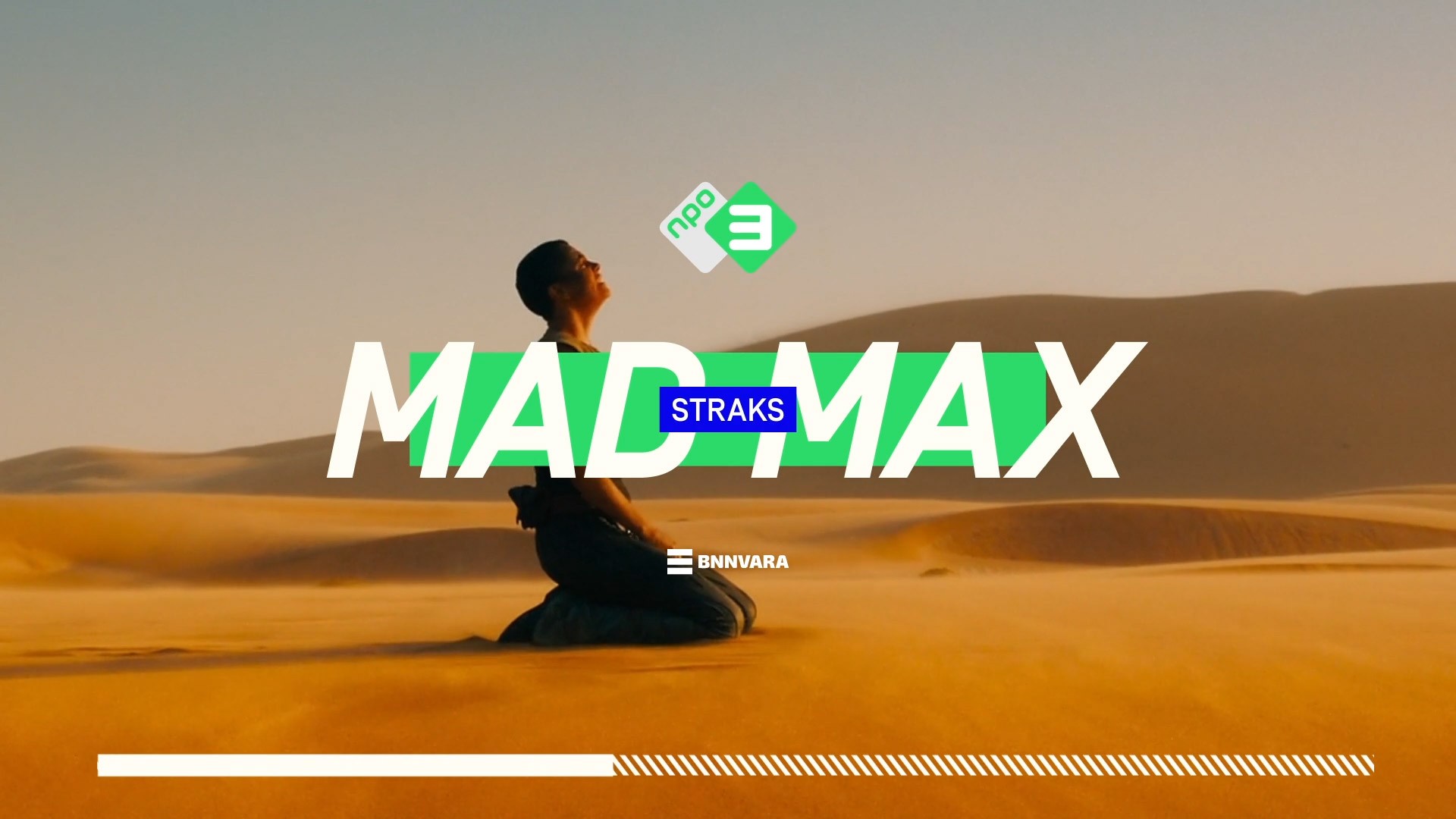
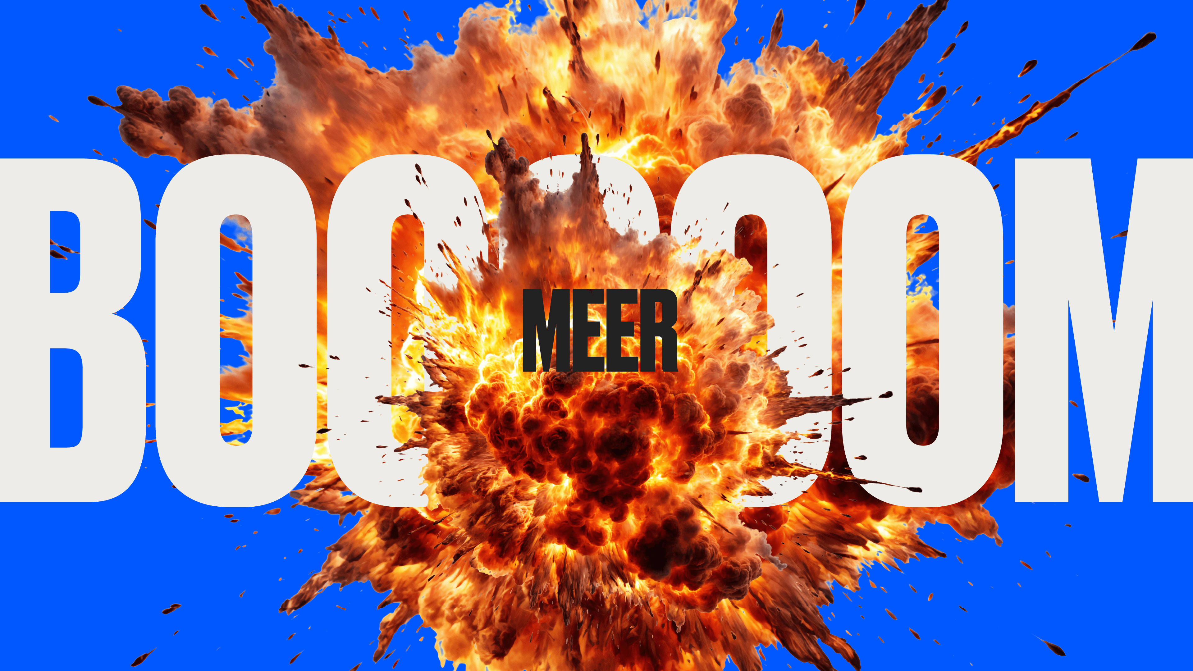
Revitalizing the top Dutch streaming service with a cohesive and dynamic new brand, delivering a fresh and engaging experience across all touchpoints. Aiming for instant recognition, we streamlined existing elements to build a bold, uncluttered brand vehicle.
Our approach
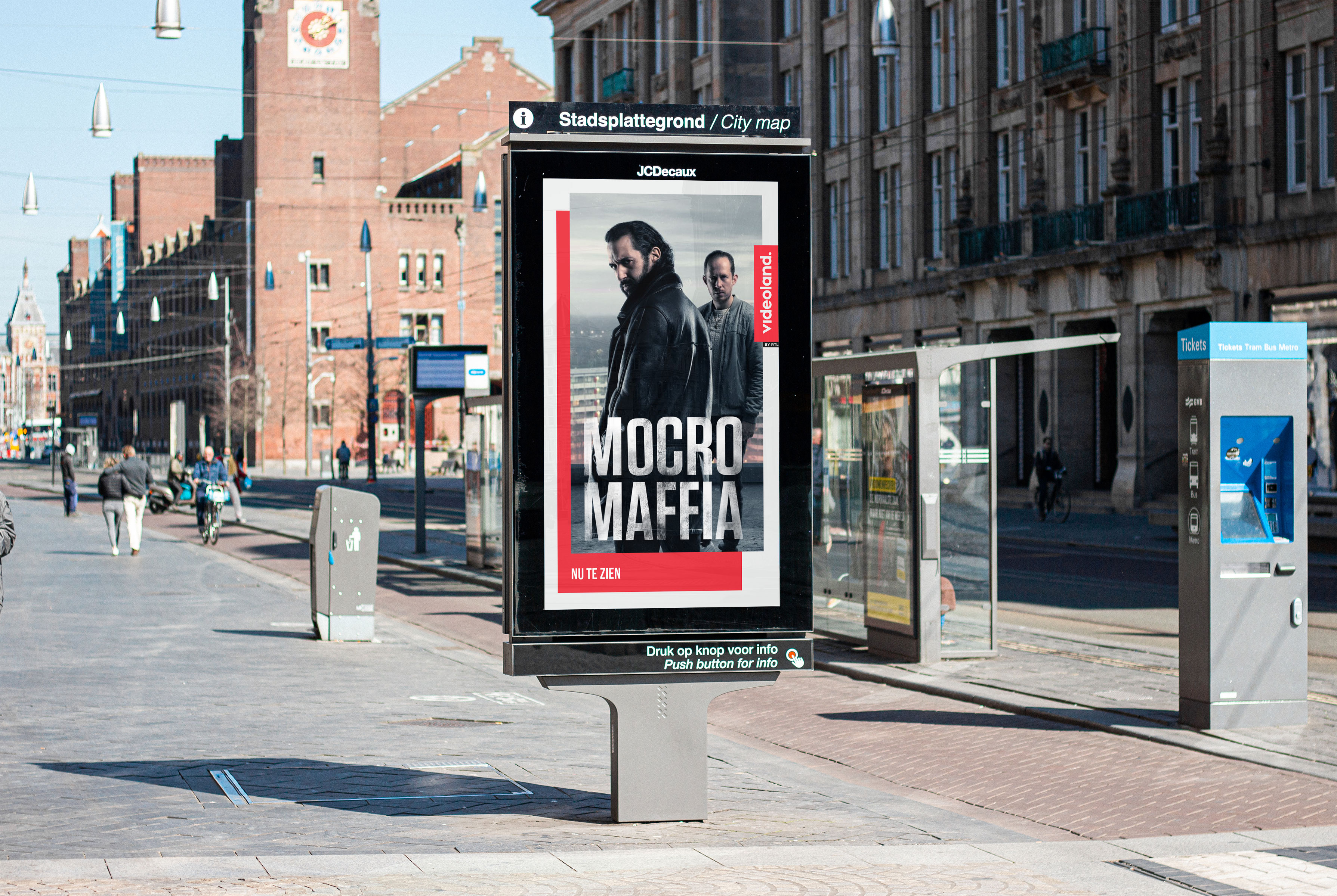
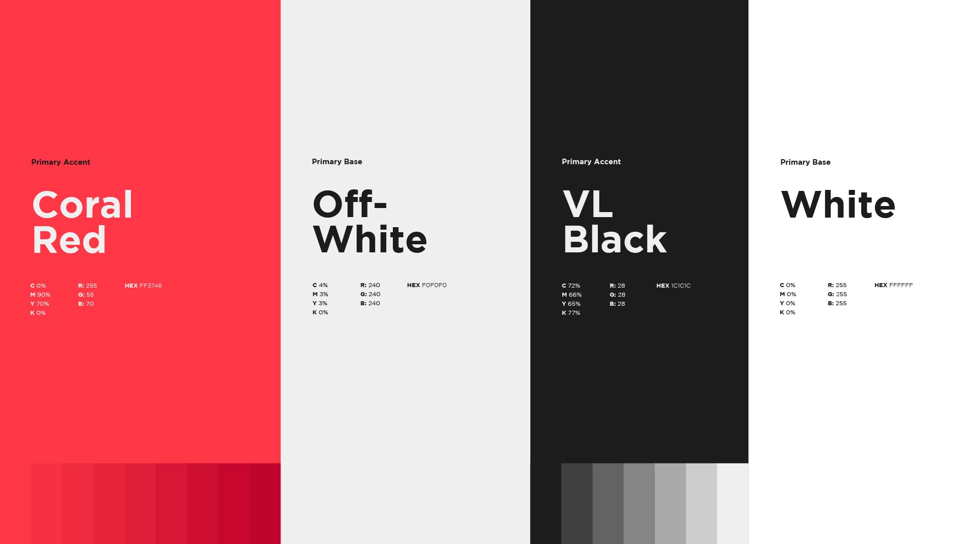
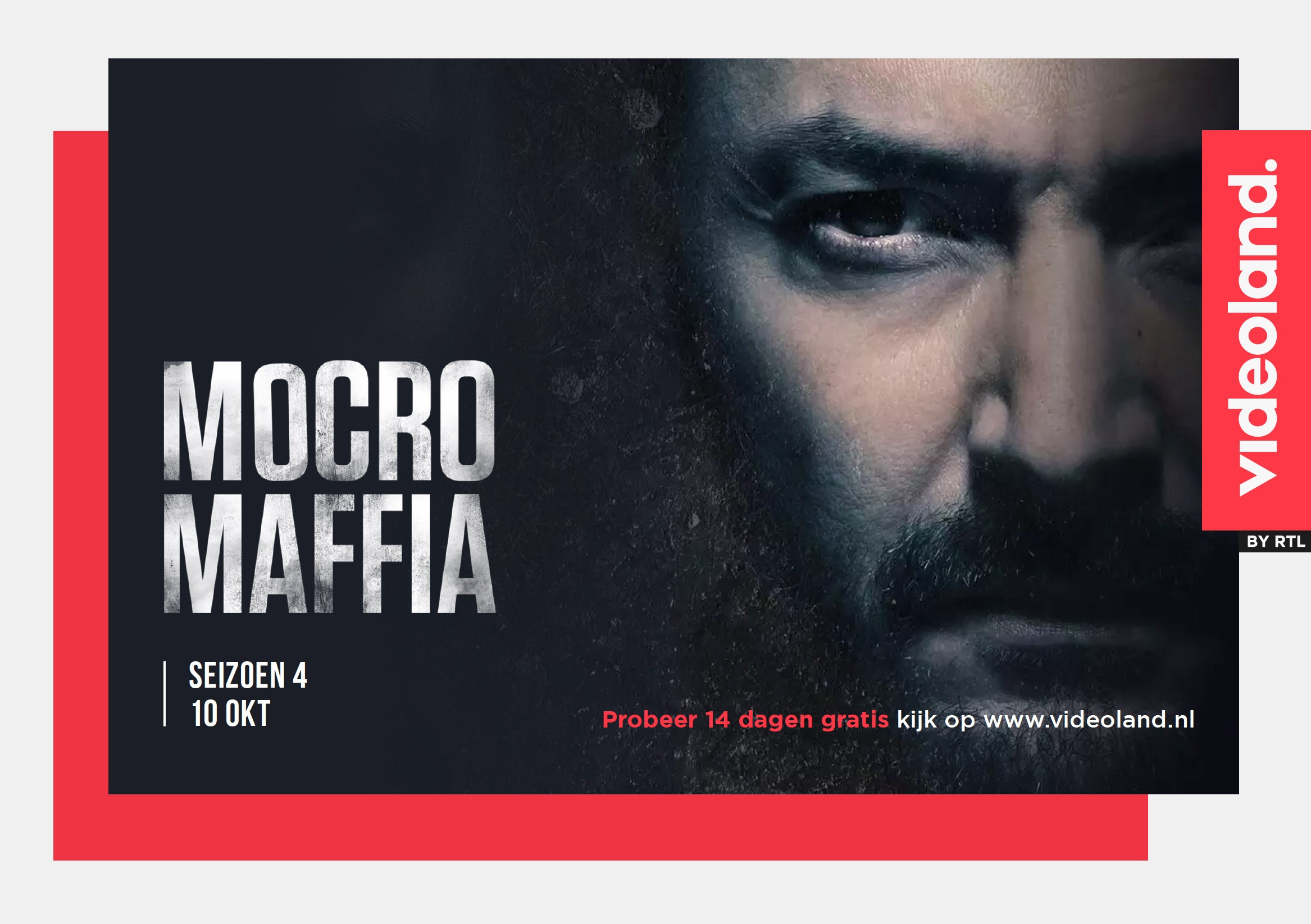
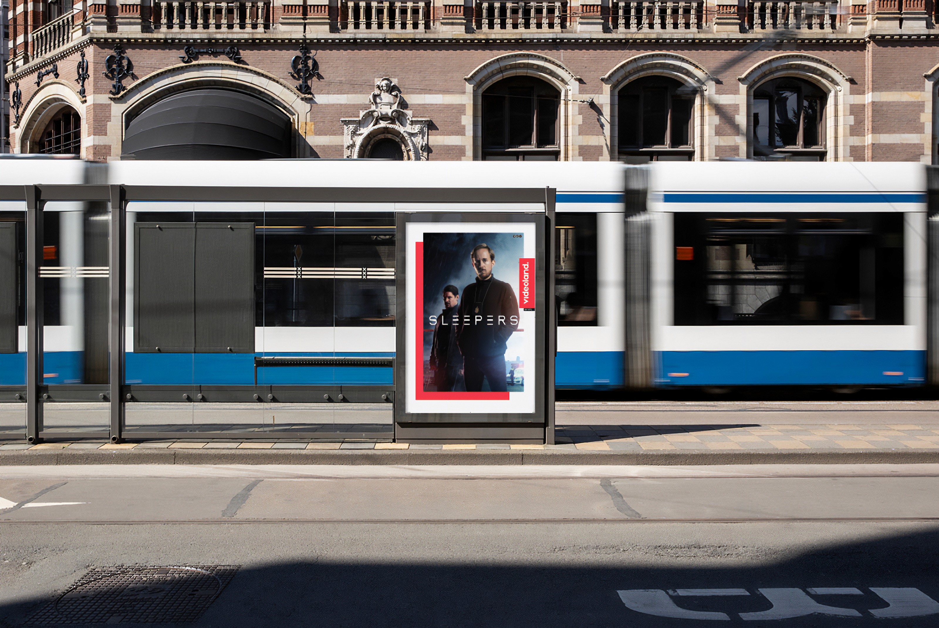
We introduced a border in a striking coral red, reinforcing the brand's core proposition, "dichtbij" (meaning "closer"), and bringing content to the forefront. This approach amplified the brand’s message and gave its communication a more impactful presence.
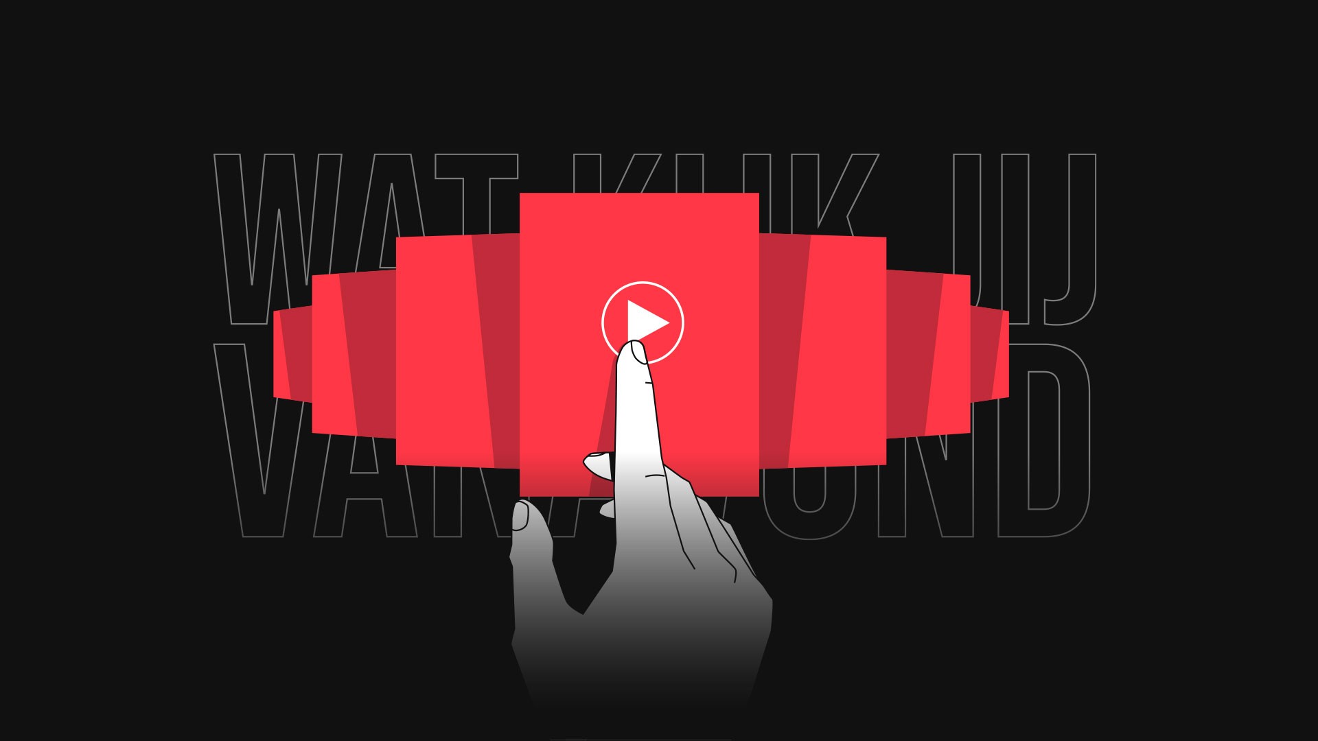
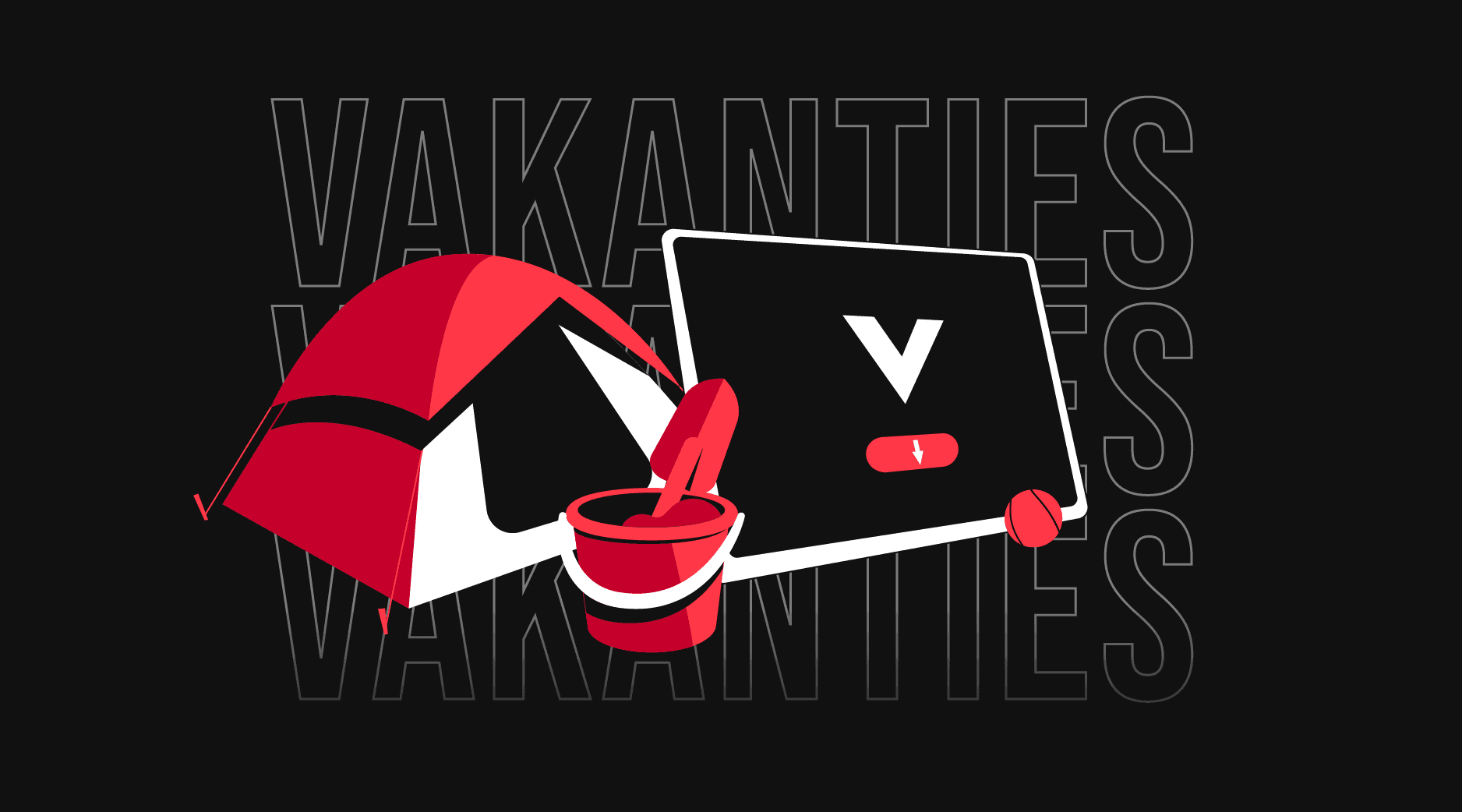
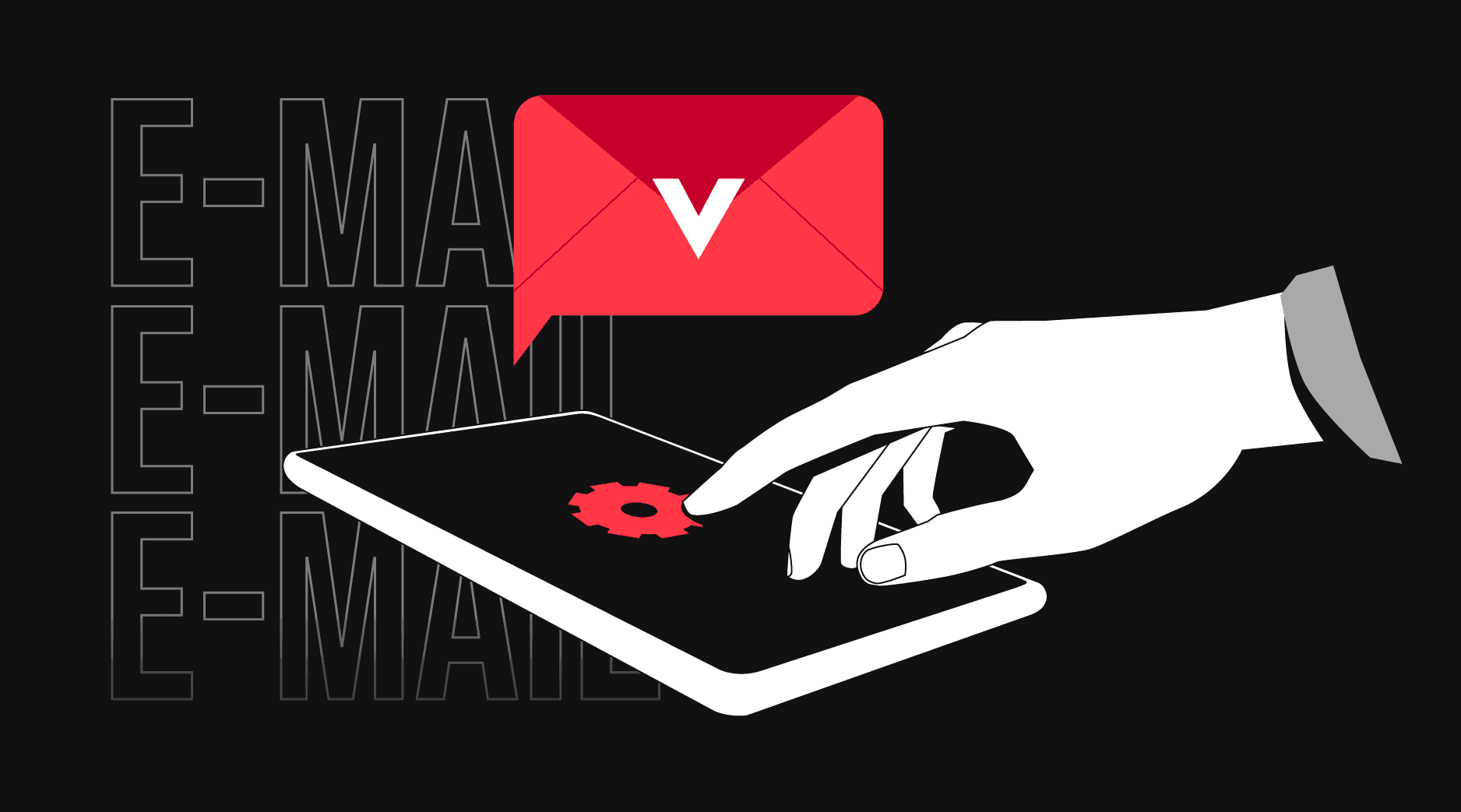
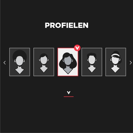
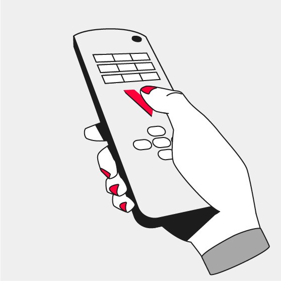
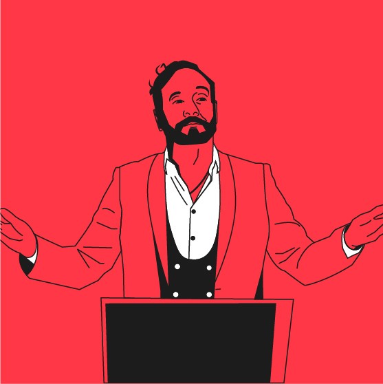
We developed a three-layer illustrated system: an iconic content layer, a UI layer for navigation, and a POV layer to immerse viewers. The result is a fresh, engaging visual direction that elevates brand communication.