NPO 3
Transforming the national youth television channel
EXPERTISE
Visual Identity
Motion Branding
CLIENT
NPO
Total Design
YEAR
2016
project info
The brief
In 2016, the Dutch Public Broadcaster NPO chose us once more to update its NPO3 channel. We were involved right from the start of the project with the NPO and Total Design team. The goal was to create a clean, functional and no fuss identity, that puts the emphasis on content and helps NPO3 to stand out in the Dutch media landscape.
Our approach
In this landscape the NPO is publicly funded, with taxpayers' money. In light of this, our plan was to make the channel more "belong" to the audience. Our objective was to create a strategy and identity that is future-proof and connects and engages the target audience across platforms.
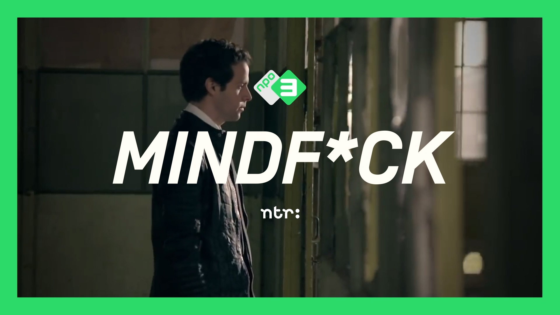
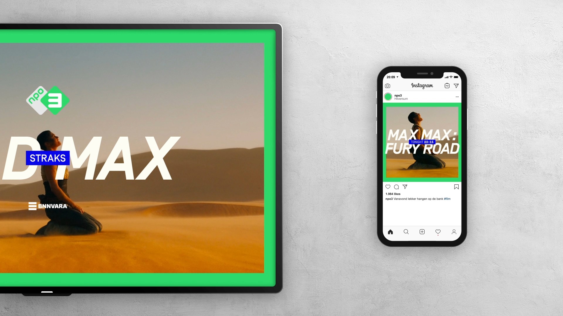
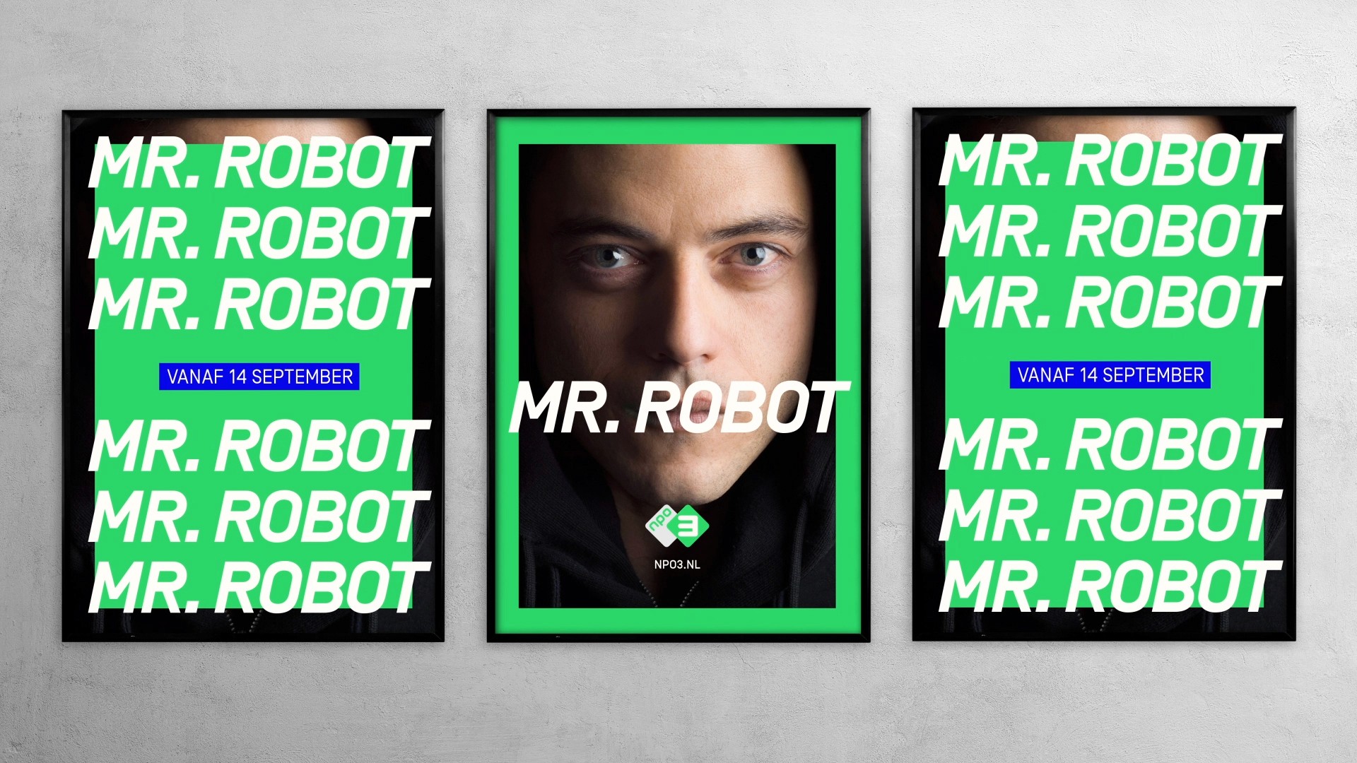
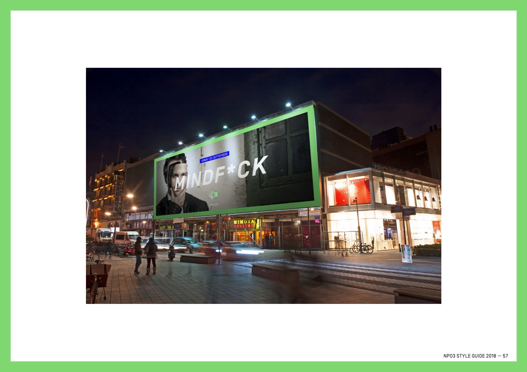
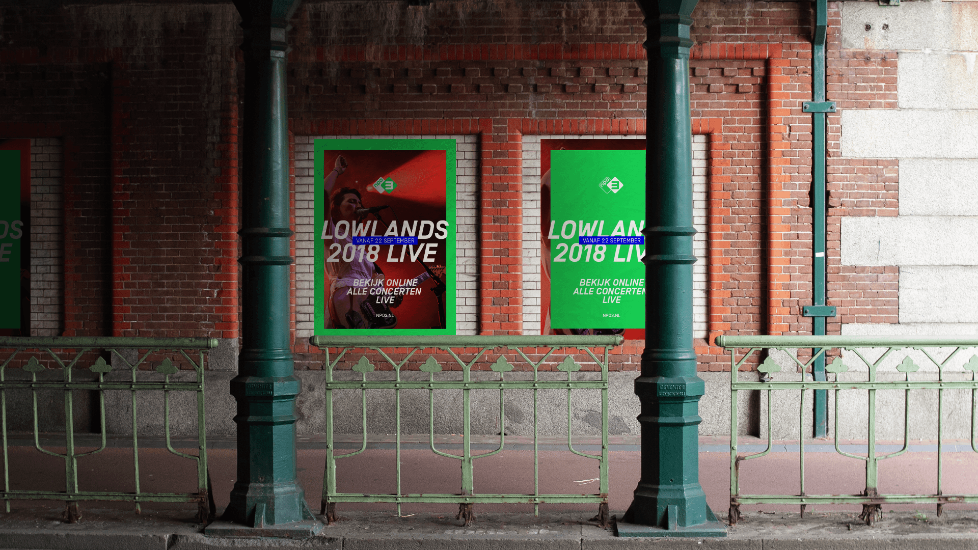
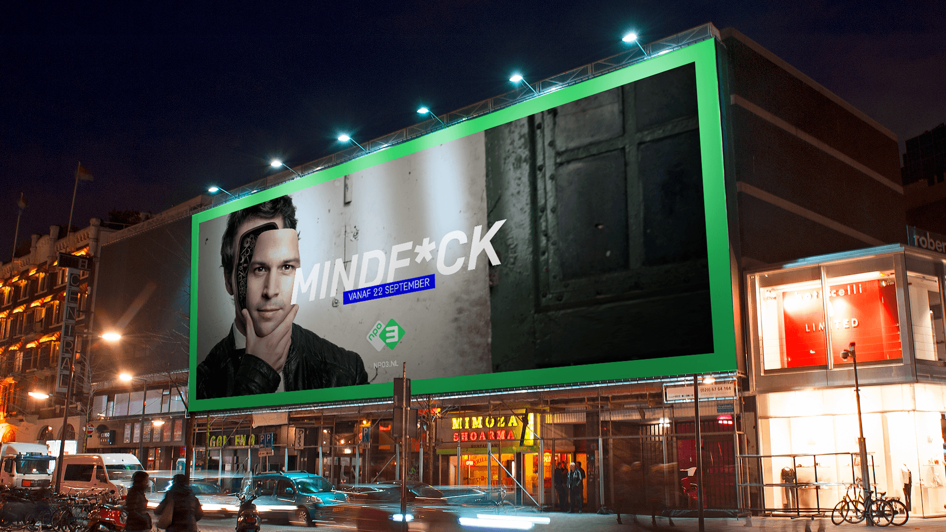
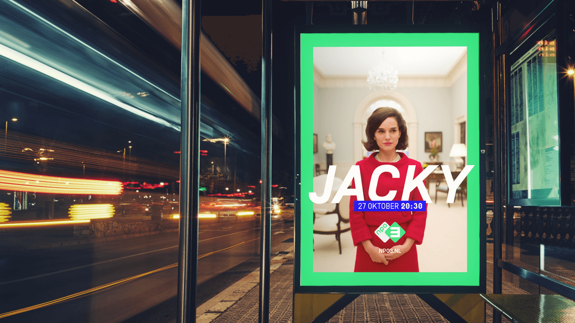
Since different public stations produce the NPO3 programming, we developed a mechanism to visually claim the material across platforms to enhance visibility and bolster the NPO3 brand.
The result
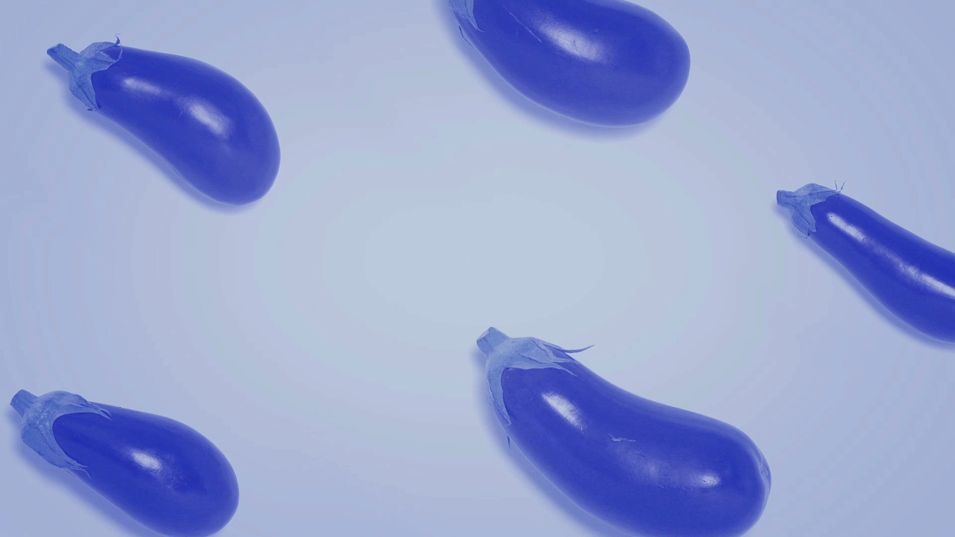
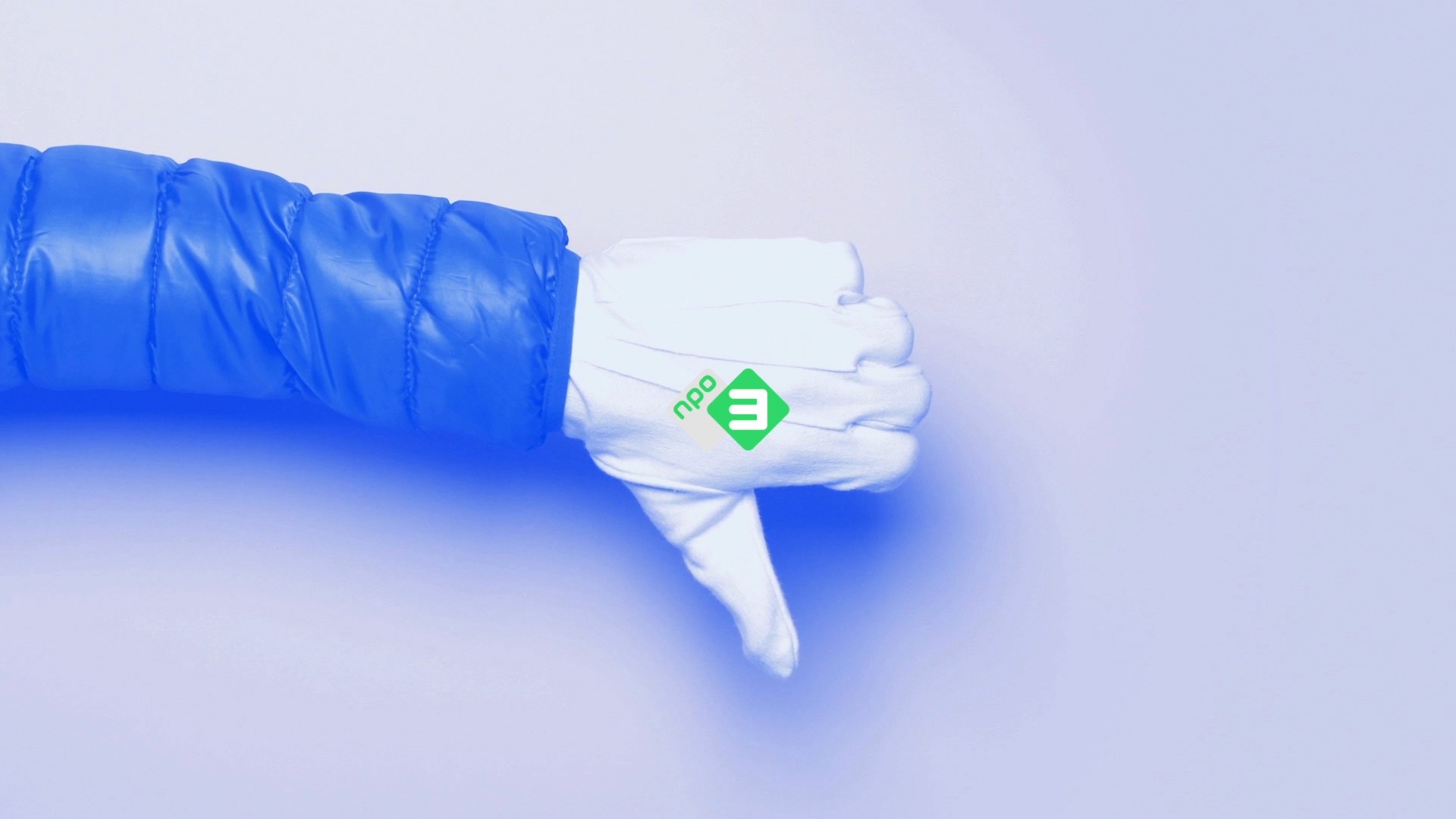
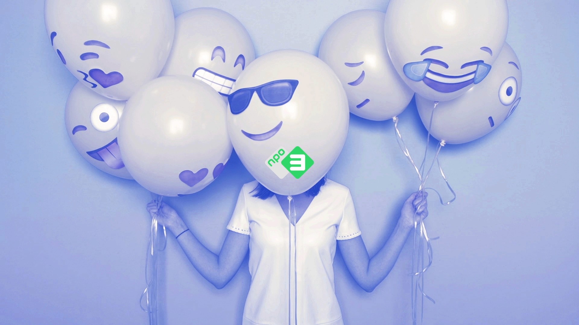
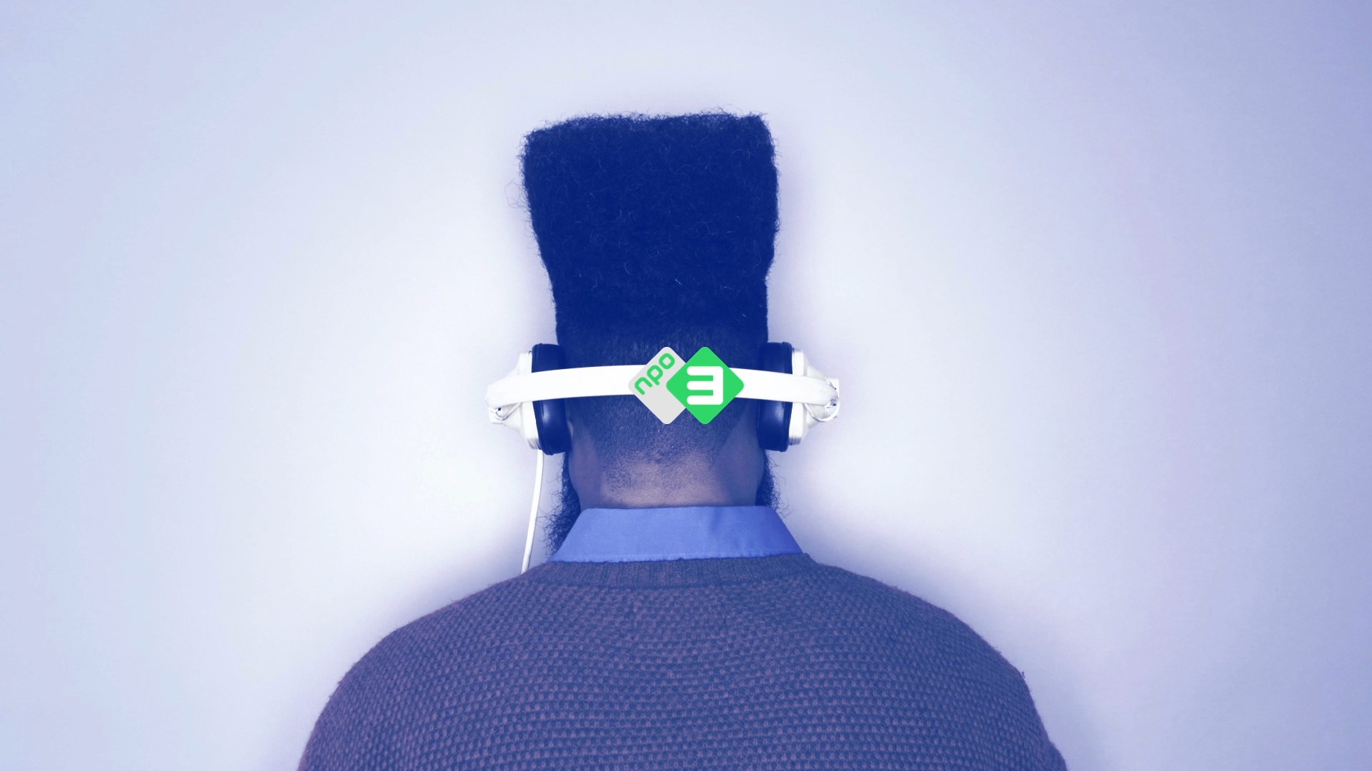
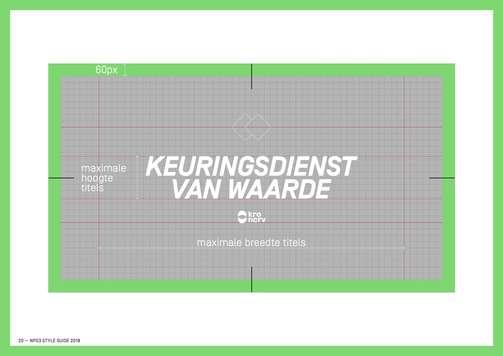
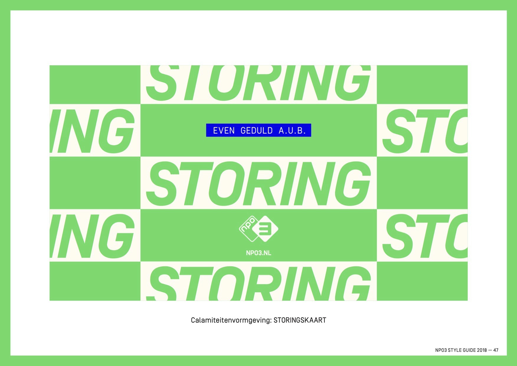
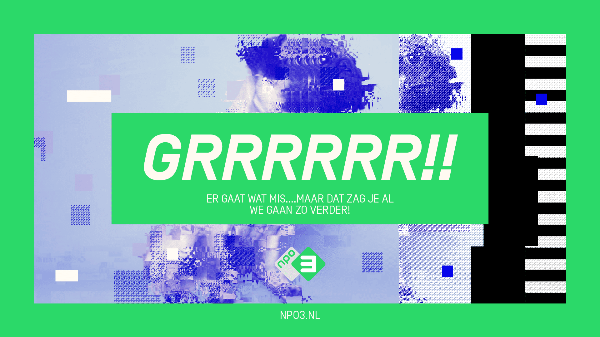
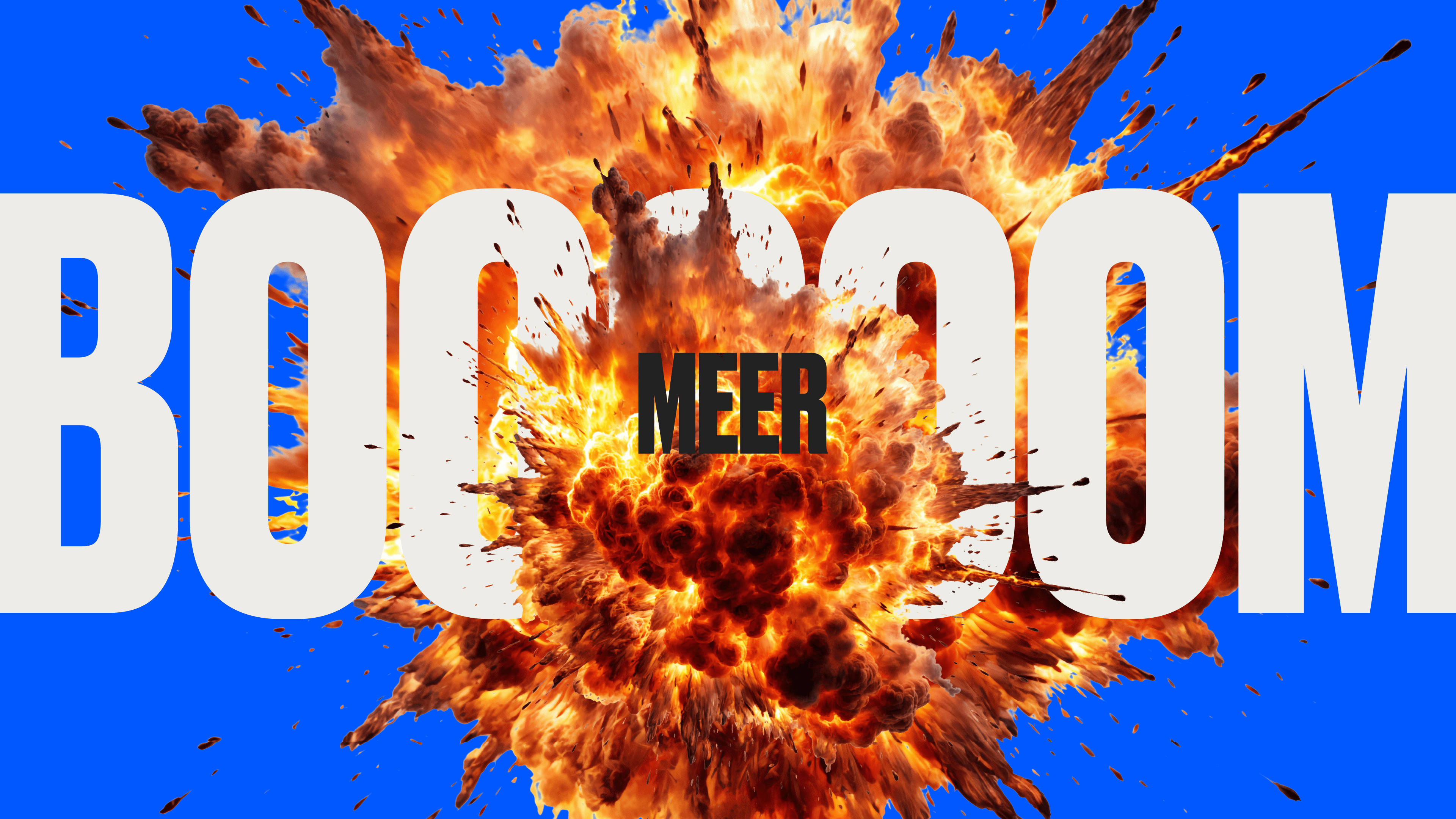
We produced live-action backgrounds for bumpers, menus, and brand shoutouts across the channel and on social media. All were influenced by internet culture and emojis.
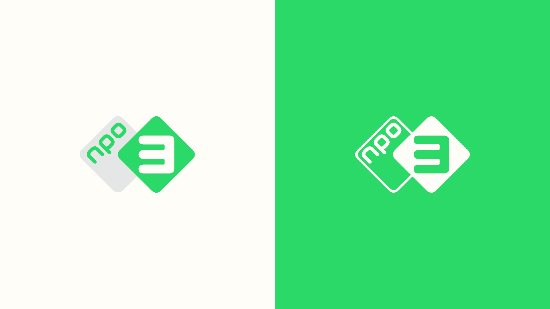
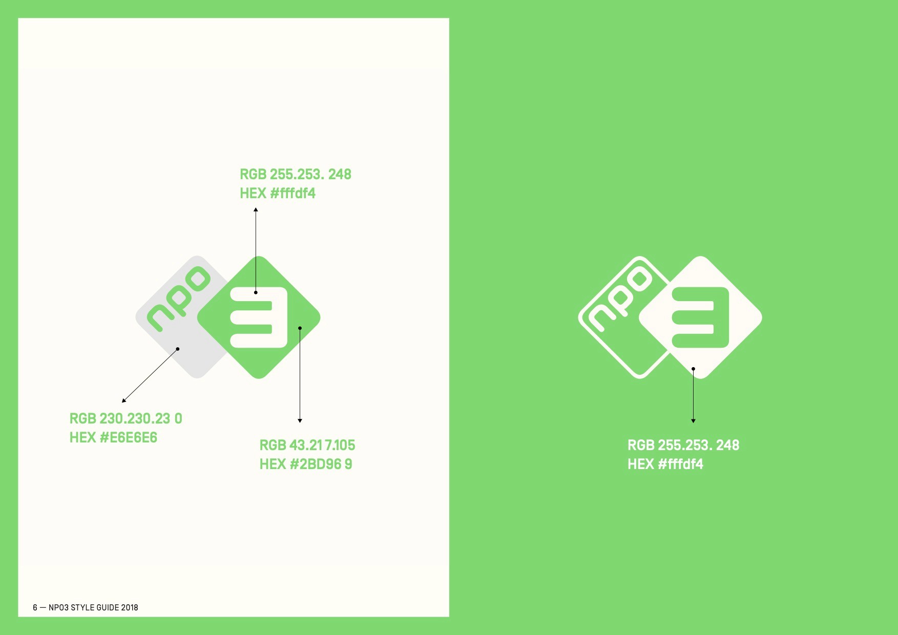
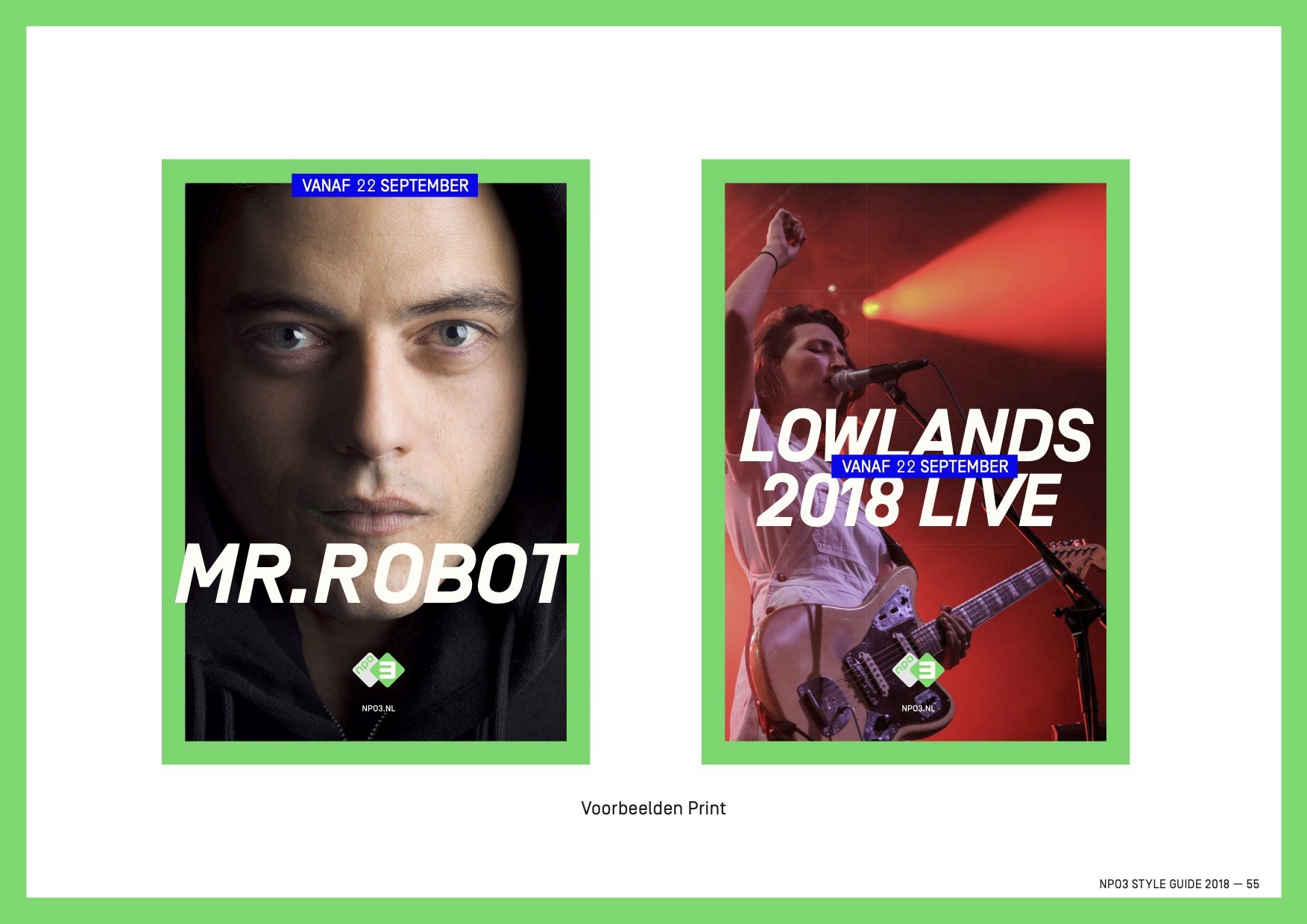
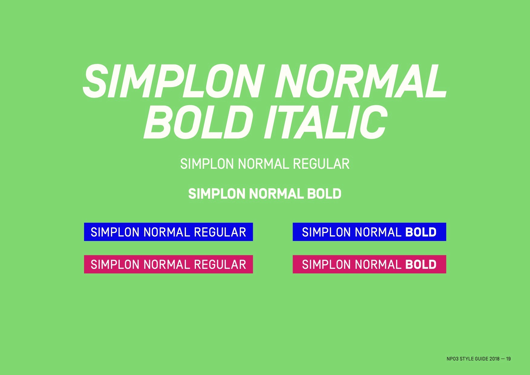
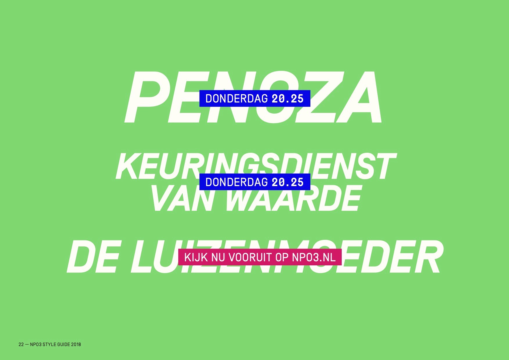
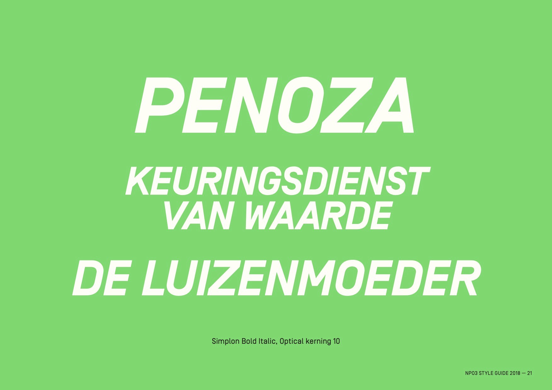
To make navigating easier, we updated the NPO3 primary brand color and added blue and magenta. Simplon typeface-based clean and uncomplicated typography was introduced, utilizing large, strong headings for improved reading on smaller devices as well as bold brand shoutouts.
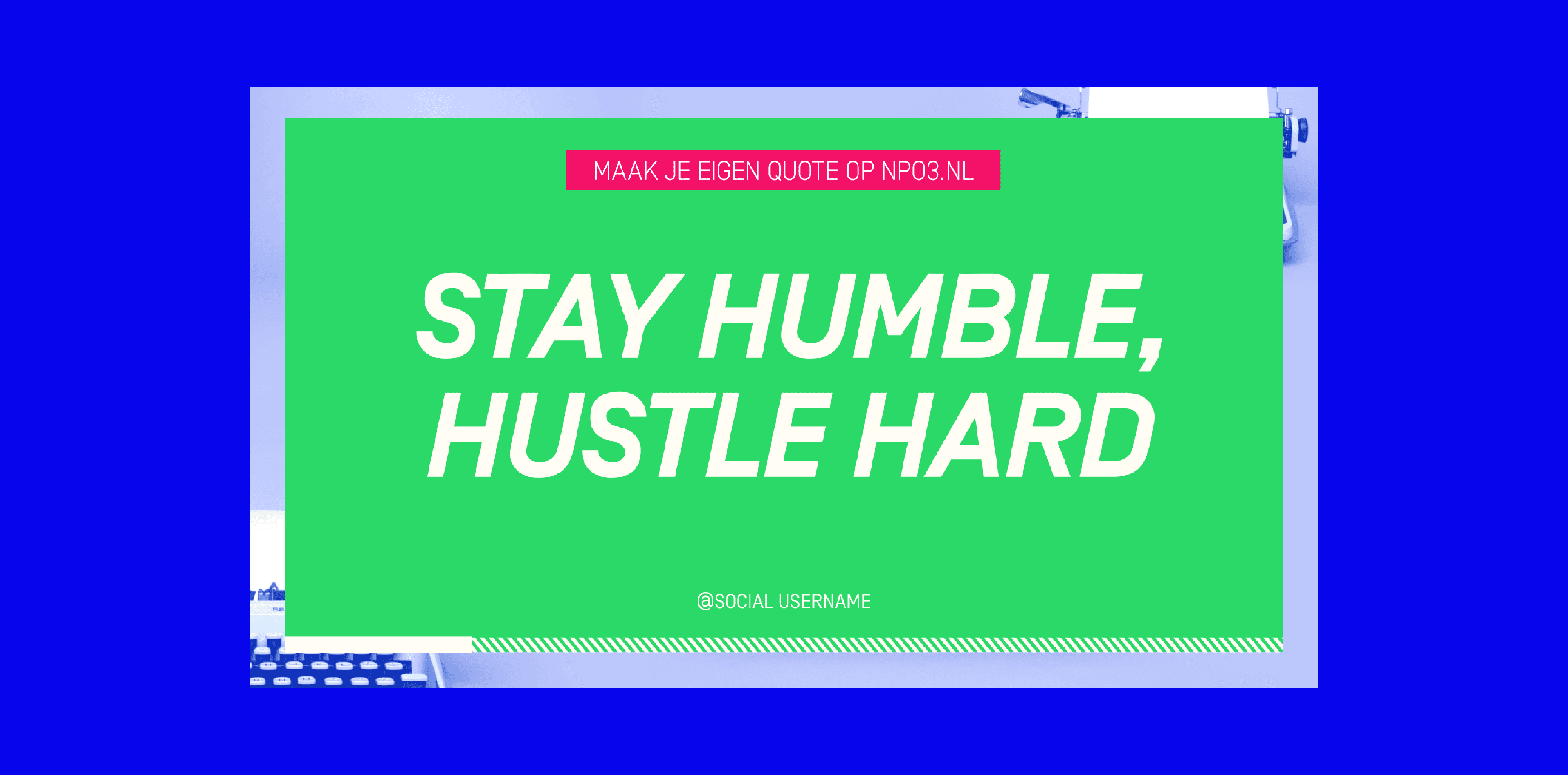
We provided a toolset for quotes that could be used as quick bumpers on social media and made by the viewer and moderated by NPO3. Following that, we debuted a collection of idents created by a chosen group of NPO3 brand ambassadors and influencers, depicting ordinary occurrences in various NPO3 themes.